Transforming Our Lower Level: A Bright, Cozy, and Playful Space in Our Home
Intentional Design, In-Floor Heating, and Kid-Friendly Solutions for a Year-Round Play Haven in Minnesota's Long Winters
We've called our main level “home” for two years, and now, as we extend our living space into what some might term a 'basement' (although that sounds too dungeon-like for our taste), we're adding another 2200 sq. feet to our intentional abode.
Our home, a rambler, or 'ranch' with a basement for those from the South, emphasizes forward-thinking design. We carefully considered the placement of air ducts and plumbing, ensuring a mindful layout for our lower level. To banish any semblance of a dungeon, we made the strategic decision to install in-floor heating.
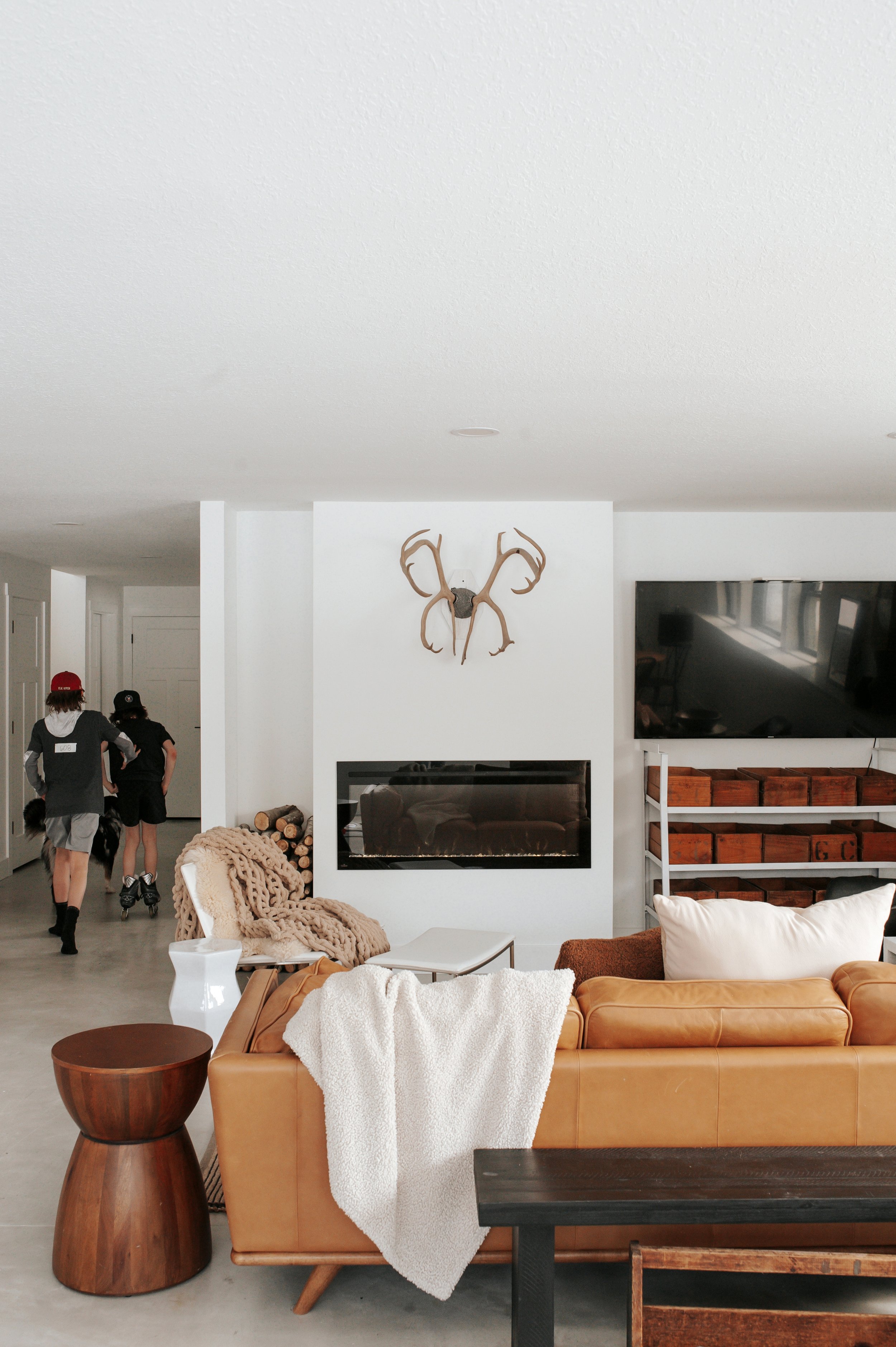
Having learned from a past mistake in our third home (now, this one is #5), where we finished the 'lower level' with LVP, we realized the importance of preserving the play area for our kids. In Minnesota, where winters can be long and harsh, the lower level transforms into a lively space for roller blades, hockey, bikes, and more—a haven for active play during cold weather. Think of it as the ultimate kids zone, akin to your upstairs/loft and movie room for our Southern friends.
Our aim in this space is intentional—bright, filled with natural light, and boasting toasty warm concrete floors. This ensures a year-round play haven for the kids, with zero worries about the floor. Stay tuned for more glimpses into this space, but for now... welcome to our living room!
Scandinavian Modern. ♡
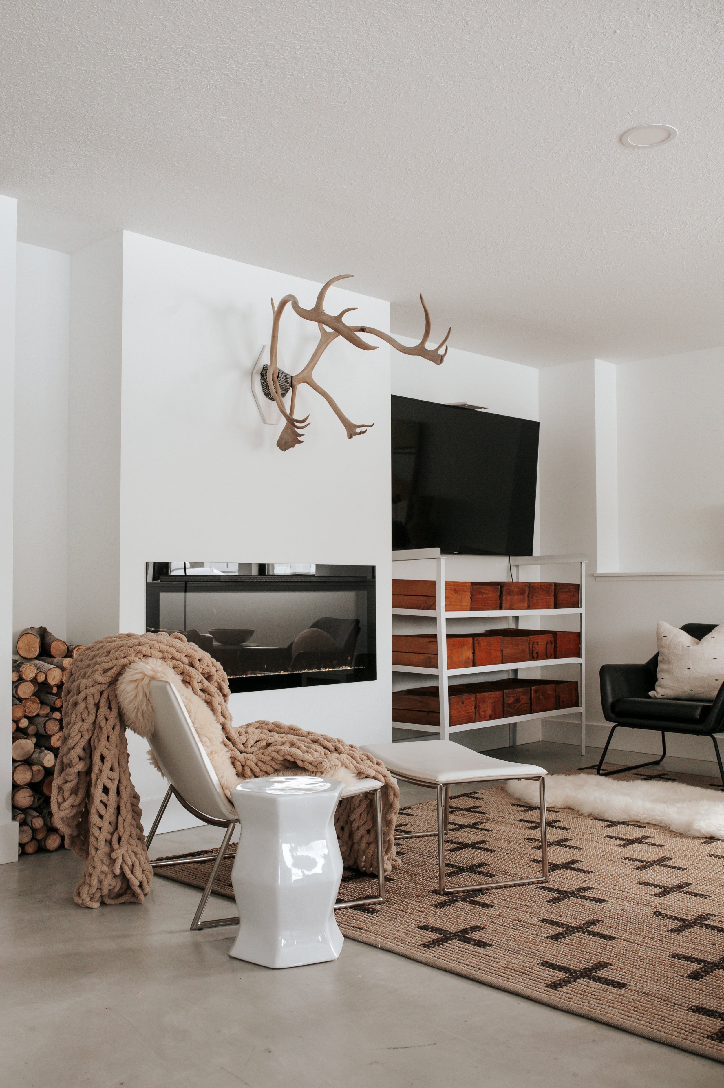
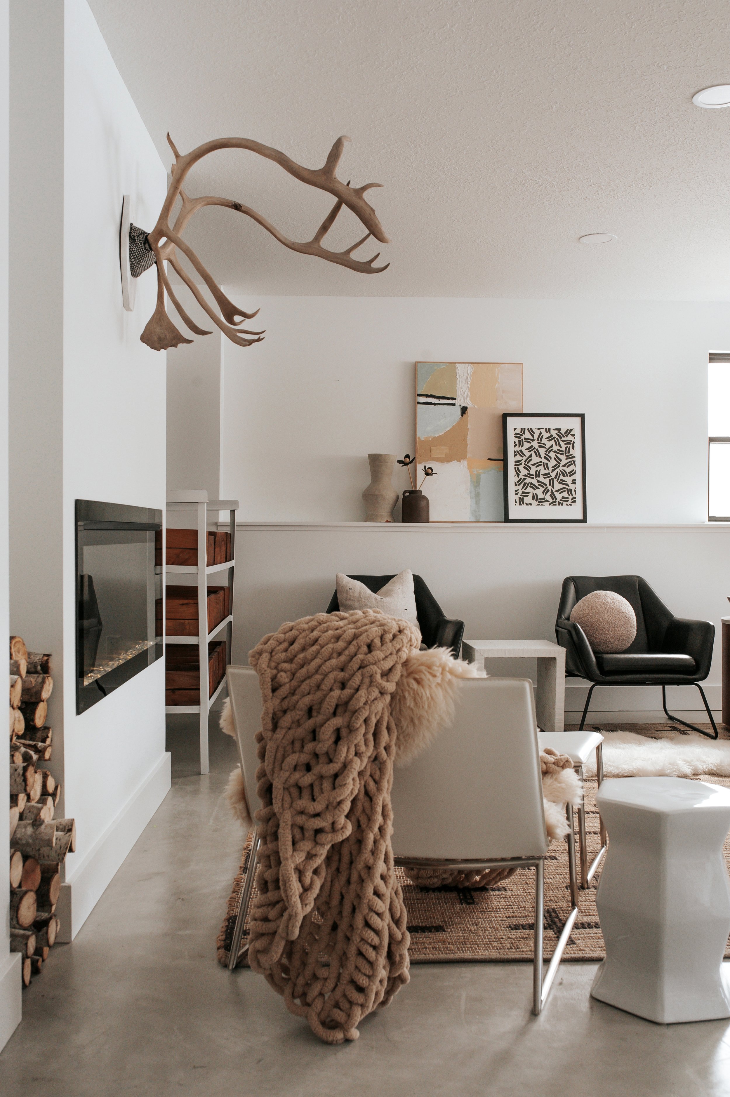
The focal wall is an offset electric fireplace (with a wood stack, for looks and emergency use for upstairs). A caribou mount, which I jokingly say, I shot it myself in Isle, MN // really, I drove there to pick it up.
This Lemieux Et Cie rug grounds the whole space. This entire line from Rugs Direct is fantastic, and you will see more of them in our home.
PAINT COLOR? We went with a brighter white downstairs than upstairs. SW: Extra White- it’s the whitest white they sell, and while some might argue, it’s stark, I actually LOVE it for a darker space. It feels modern and crisp.
The steel shelving with the boxes was a GEM find on Marketplace. The sweetest lady who I bought it from moved from Australia and hauled it with her. While I don’t think this is it’s final resting place, it works well for now to hold remotes and gaming gear.
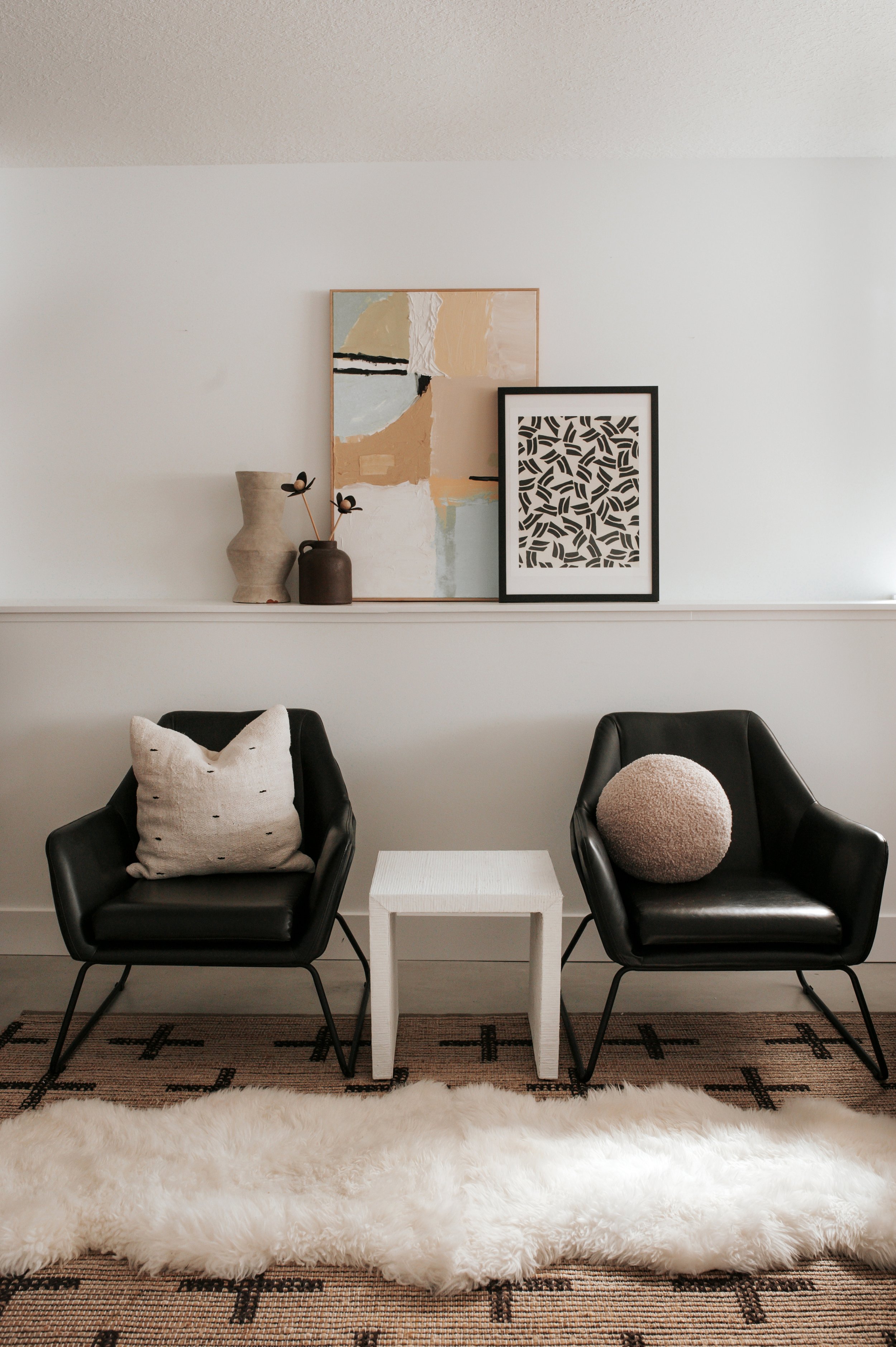
I’m not much help on the middle photo: Top Shelf- Estate Sale vases, Scandinavian sale wooden flowers, my son’s art. The black and white print is from Room and Board. Shop the photo here.
See the hallway action?
Case and Point.
I love Simple Design.
Simple, intentional + functional spaces.
Thanks for taking the time to read this, darling friends.


